Table of Contents
Tabs are a common UI element used in web development to organize content and present it in a structured and user-friendly way. In React it becomes very easy to implement this because, for most of the features of a web application, there’s a library available so is for tabs. In this article, we will be using the react-tabs library to create tabs in react or next js.
Follow the steps below to create tabs in React or next js and if you prefer to watch a video tutorial then you can watch the above video.
Project Setup
You can use react-tabs in your existing react or next js project or you can create a new project using create-react-app or create-next-app. I will be using codesandbox to create a new React project for this demo.
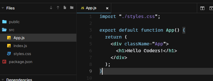
Here’s How my project looked like initially.

Install react-tabs
Now we need to install the react-tabs library in our project. To install it run the following command in your terminal.
npm install react-tabsImporting and using Tabs components
Now there are four important components from react-tabs that helps us to create a basic tab component.
These are
- Tabs is the main component that acts as the parent component or acts as the container for our tabs.
- TabList is the component that contains the list of all the tabs.
- Tab acts as the heading for each tab’s content.
- TabPanel is the component that contains the content of a single tab.
The structure of react tabs is very similar to the structure of HTML tables.
the basic structure of react tabs
<Tabs>
  <TabList>
    <Tab>Tab 1</Tab>
    <Tab>Tab 2</Tab>
  </TabList>

  <TabPanel>
    <h2>Any content 1</h2>
  </TabPanel>
  <TabPanel>
    <h2>Any content 2</h2>
  </TabPanel>
</Tabs>
Now let’s compare this with the structure of HTML tables.
<table>
  <tr>
    <th>Tab 1</th>
    <th>Tab 2</th>
  </tr>

  <tr>
    <td>Any content 1</td>
    <td>Any content 2</td>
  </tr>
</table>
Isn’t it similar? So if you know how to create HTML tables then you can easily create tabs in React or next js.
Now let’s import these components in our project.
import { Tabs, TabList, Tab, TabPanel } from "react-tabs";and import default CSS from react-tabs
import 'react-tabs/style/react-tabs.css';we can also customize the CSS of react-tabs by overriding the default CSS.
Creating Tabs
Now let’s create tabs for three countries India, Nepal, and USA, and display information about each country in the tab panel.
<Tabs>
  <TabList>
    <Tab>India</Tab>
    <Tab>Nepal</Tab>
    <Tab>USA</Tab>
  </TabList>

  <TabPanel>
    <h2>India</h2>
    <p>India is a country in Asia.</p>
  </TabPanel>
  <TabPanel>
    <h2>Nepal</h2>
    <p>Nepal is a country in Asia.</p>
  </TabPanel>
  <TabPanel>
    <h2>USA</h2>
    <p>USA is a country in North America.</p>
  </TabPanel>
</Tabs>
Now our code looks like this
import "./styles.css";
import { Tab, Tabs, TabList, TabPanel } from "react-tabs";
import "react-tabs/style/react-tabs.css";

export default function App() {
  return (
    <div className="App">
      <h1>Hello Coders!</h1>
      <Tabs>
        <TabList>
          <Tab>India</Tab>
          <Tab>Nepal</Tab>
          <Tab>USA</Tab>
        </TabList>

        <TabPanel>
          <h2>India</h2>
          <p>India is a country in Asia.</p>
        </TabPanel>
        <TabPanel>
          <h2>Nepal</h2>
          <p>Nepal is a country in Asia.</p>
        </TabPanel>
        <TabPanel>
          <h2>USA</h2>
          <p>USA is a country in North America.</p>
        </TabPanel>
      </Tabs>
    </div>
  );
}
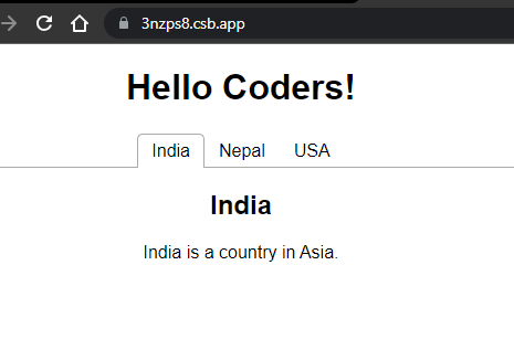
and my application looks like this

If yours also looks something like this then congratulations, You are now a certified react-tabs expert. But wait there is more.
You can utilize props and state to make your tabs more dynamic and interactive.
You can disable and enable tabs using props.
To disable a tab you can use disabled prop.
<Tab disabled>Disabled Tab</Tab>In our application let’s put it on one of our tabs.
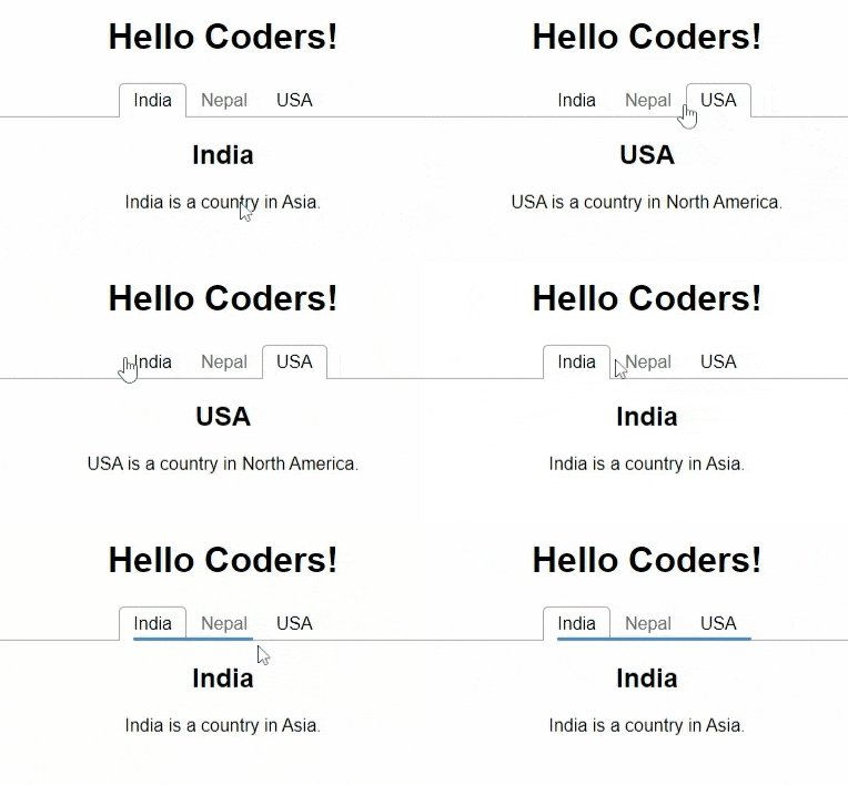
<Tab disabled={true}>Nepal</Tab>I put it on Nepal and now Tab for Nepal is no longer clickable until we remove the disabled or turn it to false.

We may use this when we want to disable a tab based on some condition like if the user is not logged in then we can disable the tab that contains the user profile information.
Creating Multilayer Tabs by Nesting
We can also create multilayer tabs using react-tabs by nesting tabs inside TabPanel.
For example we can create Tabs for different cities for each country.
<Tabs>
        <TabList>
          <Tab>India</Tab>
          <Tab>Nepal</Tab>
          <Tab>USA</Tab>
        </TabList>

        <TabPanel>
          {/* Nesting Tabs for cities */}
          <Tabs>
            <TabList>
              <Tab>Delhi</Tab>
              <Tab>Mumbai</Tab>
            </TabList>

            <TabPanel>
              <h2>Delhi</h2>
              <p>Delhi is the capital of India.</p>
            </TabPanel>
            <TabPanel>
              <h2>Mumbai</h2>
              <p>Mumbai is the financial capital of India.</p>
            </TabPanel>
          </Tabs>
        </TabPanel>
        <TabPanel>
          <Tabs>
            <TabList>
              <Tab>Kathmandu</Tab>
              <Tab>Pokhara</Tab>
            </TabList>

            <TabPanel>
              <h2>Kathmandu</h2>
              <p>Kathmandu is the capital of Nepal.</p>
            </TabPanel>
            <TabPanel>
              <h2>Pokhara</h2>
              <p>Pokhara is the city of lakes.</p>
            </TabPanel>
          </Tabs>
        </TabPanel>
        <TabPanel>
          <Tabs>
            <TabList>
              <Tab>New York</Tab>
              <Tab>Washington</Tab>
            </TabList>

            <TabPanel>
              <h2>New York</h2>
              <p>New York is the financial capital of USA.</p>
            </TabPanel>
            <TabPanel>
              <h2>Washington</h2>
              <p>Washington is the capital of USA.</p>
            </TabPanel>
          </Tabs>
        </TabPanel>
      </Tabs>
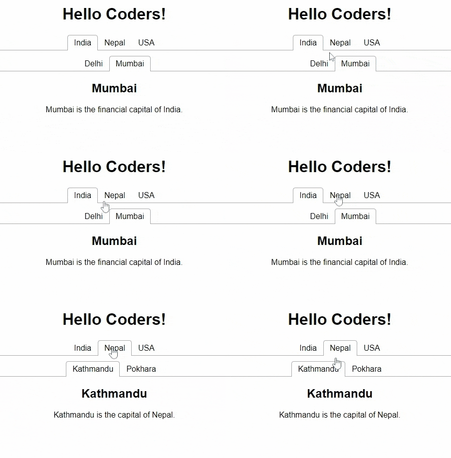
As you can see we are just nesting the Whole Tab structure inside Tabpanel to create a multilayered tab and now our application looks like this.

There are still many customizations that you can try yourself to know more about this visit the official documentation.
Codesandbox for this tutorial :
I hope you liked this tutorial, Happy coding.


